Let's reflect on the 2020 IWD Typography Competition winners
February 23, 2020
We're thrilled to announce the winners of the IWD 2020 Typography Competition, run in association with Typism, to celebrate the work of women typographers.
The competition formed part of IWD's Women Creatives Mission that aims to increase the visibility of women creatives and promote their work for commercial projects.
Women typographers worldwide were asked to submit creations in either of two categories:
- an #EachforEqual creation
- a Happy International Women's Day creation
The response was astounding with nearly 300 brilliant entries received.
A further category continues to run throughout the year, calling for women's empowerment creations.
Three fabulous #EachforEqual creative winners
Congratulations to the three impressive winners for the #EachforEqual category. See their winning entries below, learn about their process and hear what the #EachforEqual campaign theme means to them.
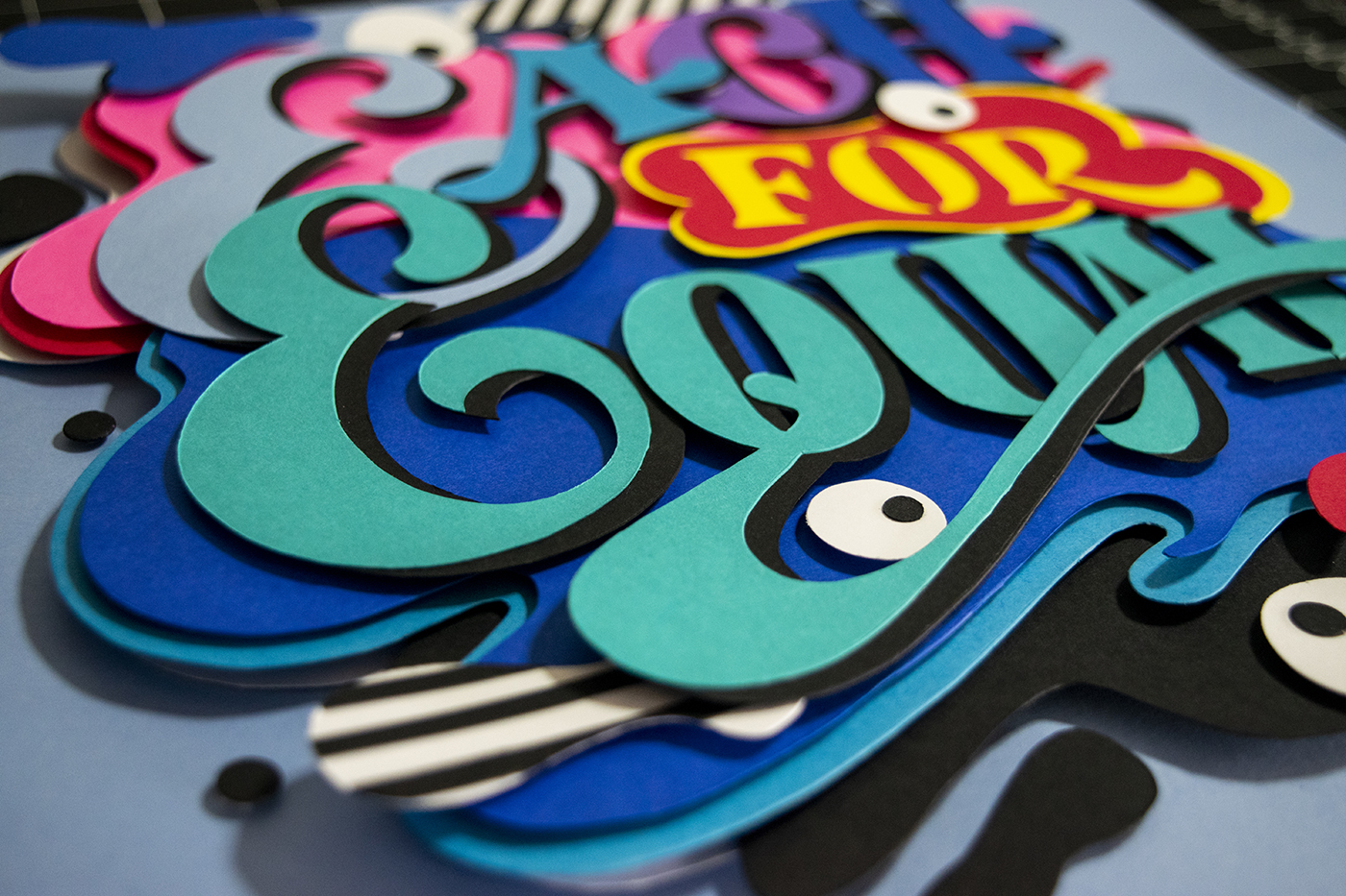
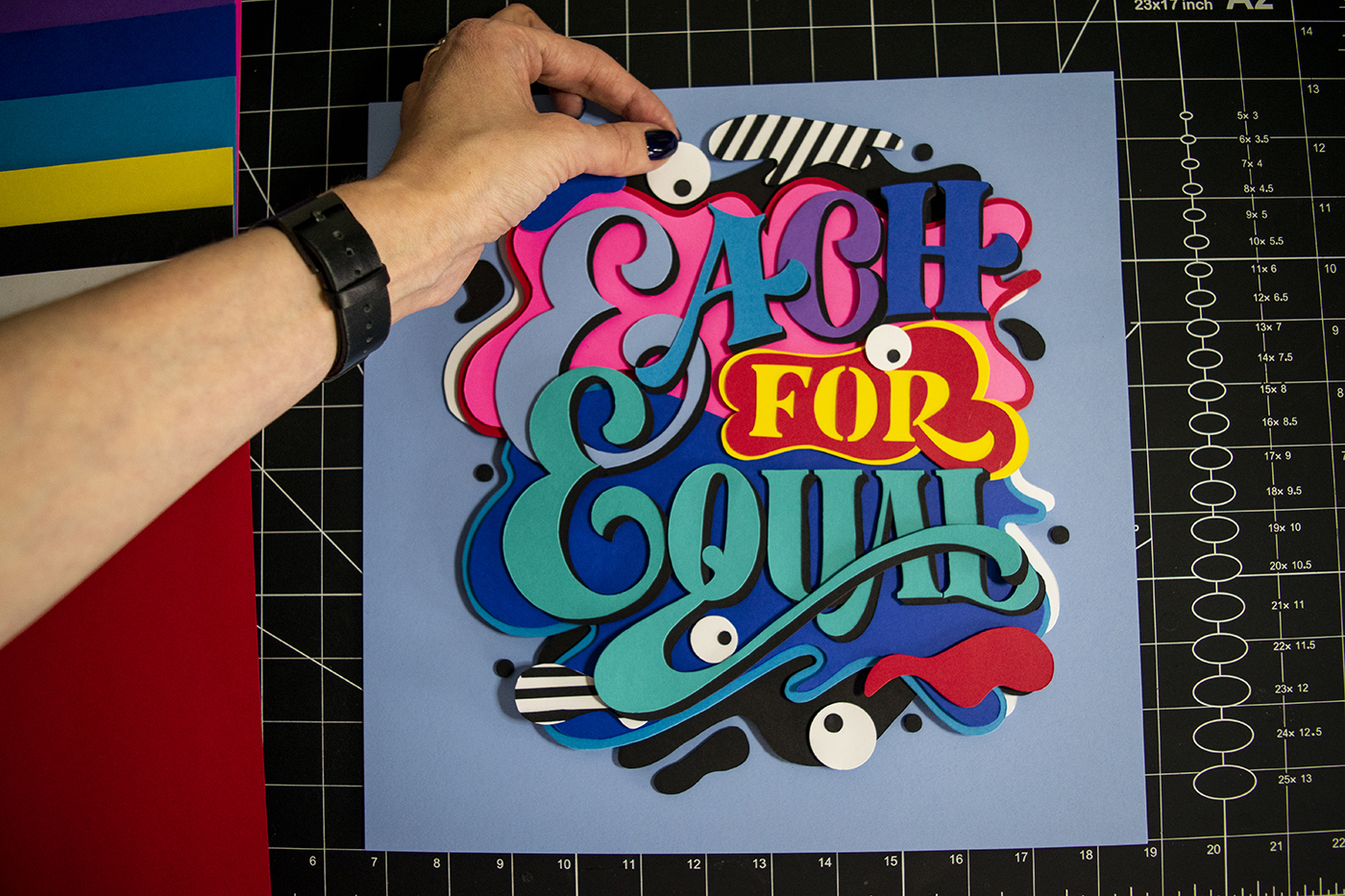
Vera Drmanovski
Instagram: @vera.drmanovski

How do you describe yourself?
A persistent and passionate, cut out for paper cuts (pun intended) lettering artist, who believes that child-like creative curiosity and humour are essential for personal and professional success.

What is the concept behind your design?
I took an abstract and playful approach with this piece. I strategically used colour and shape to communicate the message behind #EachforEqual as they represent our individuality and uniqueness, and equality in opportunity. A mission behind this campaign theme is to raise visibility and opportunity for female lettering artists, I thought the eyeballs would be a good way to symbolize that mission in my design, plus they look cool.


What was your process for creating the artwork?
I always start with a sketch and make the most of my creative decisions in this stage of the process. This is a stage where I experiment a lot until I find the right concept. Once the conceptual stage is completed, I move to Adobe Illustrator to create vector art that is later used as a cutting template. This is when I start playing with colour, so before I move onto making a paper art, all creative decisions are made and I have a solid vision of how the final artwork will look. Then the fun part starts, cutting my designs. I use the template created in Illustrator to transfer the design so that my cuts are as accurate as a human hand can create. All my pieces are cut by hand on purpose, as I love the imperfect organic look of the final art.
What does being #EachforEqual mean to you?
Equality is a romantic thought unless everyone is on the same page. That is exactly what #EachforEqual means to me. But it will not happen organically, work needs to be done to make this a reality, and we all have a part to play. Recognizing and embracing our differences is the key; see the beauty in it, not a threat. It not only applies for career opportunities but equality in all aspects of life for every individual on this planet.
What are your views or comments regarding gender issues relating to the world of women typographers?
We are living in a time of major social change, and gender roles are a part of that change. I do believe that one of the reasons for the disbalance is the double standard when it comes to age with women and men. Often women, under the social pressure, give up on their dreams and goals after they reach a certain age, therefore shortening the time and opportunity to succeed. Partly there is still a stigma out there, and partly we do it to ourselves as we see age on our faces. World of lettering and graphic design is presented as a young people’s game and as a person who got into this game later in life, I used to feel the need to hide my age as I feared judgement. I think it’s very important to recognize this and to encourage women of all ages to pursue their passion and never give up. It’s not the age that counts, it’s how you use it.
Reiko Hirata
Instagram: @letterordie

How do you describe yourself?
I’m a Japanese expat for the last two decades, currently based in Milan, Italy via Los Angeles, CA, USA. I’m a freelance graphic and motion designer with a strong interest in letterforms, and I discovered my love for lettering 6 years ago.
What is the concept behind your design?
For this piece, I wanted to express and celebrate unity among women/people and acceptance of diversity. I decided to use women’s smiling faces for a positive attitude through the message in lettering on top.
The faces are in different shapes to represent diversity. The ornamental lines are not only decorative, but also can be perceived as hair, ribbons (representing celebration), and strings to connect each other (representing the sense of unity).

What was your process for creating the artwork?
I did quick thumbnails on paper, then I worked on all the rest digitally: sketch to inking with Procreate, finalized in Photoshop.


As a lettering style, I wanted to do something dynamic, energetic, and positive. Therefore, I decided to use a slab serif with interlocks with a mid-century flare, which is something that comes naturally to me.
What does being #EachforEqual mean to you?
It’s not only about women, but about every human being.

What are your views or comments regarding gender issues relating to the world of women typographers?
Right now, I am mainly working as a graphic and motion designer, so I don’t have a direct experience in the typography field. Personally, I have never had any major issue being a woman in the design field in the US nor in Europe, but I have to admit that in my beloved home country of Japan, before undertaking this career path, I felt the weight of the difference in gender expectations in the working environment. Unfortunately, Japan still is a patriarchal society. I really hope that will soon change for future generations.
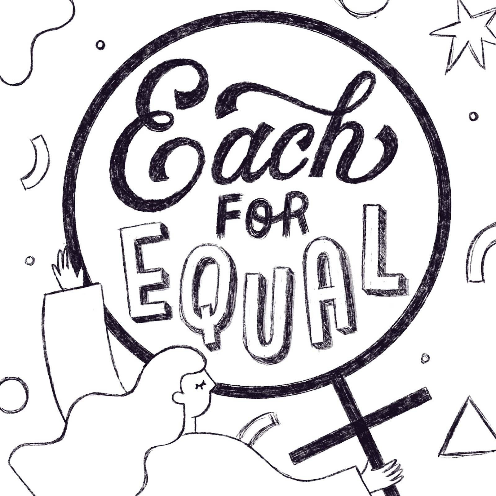
Sonia Yim
Instagram: @just.drawing.words

How do you describe yourself?
I'm a hand-lettering artist and illustrator based in California. My speciality is telling a creative story through all my art. In addition, I love adding a positive spin to my art pieces and using bright and bold colors.
What was your process for creating the artwork?
All my process starts with a concept. I wanted to convey a strong 'feminine' concept while emphasizing the typography. As such, I utilized the female sign (with the typography inside the sign) as the focal point of my design. In addition, I wanted to use the female sign as the magnifying glass to further emphasize the meaning of #EachforEqual.

What does being #EachforEqual mean to you?
#EachforEqual means making a world art community to create a gender equal world. One of my goals as an artist is to overcome any challenges we face as female artists and to celebrate our achievements together.
What are your views or comments regarding gender issues relating to the world of women typographers?
I think the view toward 'women and typography' is changing. I believe it used to be more male dominant, however, I see so many talented ladies breaking this barrier. And I'm all for celebrating that.
Happy International Women’s Day Winners
Congratulations to the fabulous winners for the 'Happy International Women's Day' category. See their winning entries below, learn about their process and hear what IWD means to them.
Evgeniya Antonova
Instagram: @antonova.lettering

How do you describe yourself?
I am a graphical designer and an illustrator from Moscow.
A couple of years ago, I fell in love with lettering and started experimenting in this area. I like to combine illustration and lettering adding a bit of humour. Drawing letters is my real passion nowadays.
What is the concept behind your design?
In this specific work, I tried to show a woman in her calmness, love and beauty. She is free and happy. This is what I feel today, and what I have always been trying to find. This is the harmony in myself – the harmony I have tried to depict in letters.

What does International Women's Day mean to you?
In Russia, Women's Day is an important holiday. We greet our loved women of all ages with flowers and gifts trying to make this day a special one for them. It’s not much about women fighting for their rights. It’s just a happy family holiday that we all love
Stéphanie Deldicque
Instagram: @s9photographizm_art

How do you describe yourself?
I'm stéphanie aka s9photographizm. I'm a thirty-something French woman who does lettering, graphic design and I'm also a photographer.

What is the concept behind your design?
The concept behind my design is the old school posters, but I wanted to give a touch of modernity by my style of "wavy" lettering and the flashy colors, pink being a reference to women for a long time.


What was your process for creating the artwork?
For my process, I prefer to start on paper for drawing my letters and then I move on to Photoshop with the graphic tablet to clean this and add the colors and texture.
What does International Women's Day mean to you?
I think it's important that women should have the same rights as men without having to justify themselves. Men don't have to, so why should we? I don't understand that in the 21st century we still have to do this. So come on ladies, we have girl power.
What are your views or comments regarding gender issues relating to the world of women typographers?
I've observed some changes with people like "gemma o'brien", "homsweethom" or "jimenezlettering" (and there are a lot of more). People started to see that lettering or graffiiti, or more generally painting, wasn't reserved only for men. Movements like International Women's Day or 'ladieswhopaint' are represent many women. When I saw this, I was happy to see other women doing these murals or lettering - and they inspired me to do the same.

Anna Suvorova
Instagram: @suvorovaart.ru

How do you describe yourself?
I have been doing calligraphy and lettering for seven or eight years. I teach at the Suvorova School. I participate in festivals and exhibitions of calligraphy in Russia. I wrote and published two books and two recipes on calligraphy and lettering.
What is the concept behind your design?
I wanted to draw something after a hard day. I went to the website and saw it was the last day for accepting work. I decided to draw my inscription - and I saw usng the hashtags there were already many wonderful entries. I was not even sure that I would get my entry in on time. So it was quite by chance that this work was born.
What does International Women's Day mean to you?
I like International Women Day. This holiday is associated with spring, awakening, the sun and good weather.
What are your views or comments regarding gender issues relating to the world of women typographers?
The gender problem in typography and calligraphy exists, while from the lips of women and men we hear phrases such as “Women's calligraphy”, “Men's calligraphy”. While people think such phrases will be a problem, I believe that in calligraphy there is no such separation. This is fiction and stereotype. I hope that over time this separation will be less common and will disappear altogether.
Looking for a woman typographer for a commercial project?
While these winners undoubtedly have fantastic skills and creative vision, there are many further talented women typographers who available for commercial assignments.
Just take a look through all the incredible entries here. Many women, many skills, hopefully many commissions.
And thank you to all the women who submitted entries and participated in the IWD #EachforEqual competition.
Remember, entries remain open throughout the year for women's empowerment creations. To submit an entry find out more here - and simply post your creation on istagram using the hashtags: IWD2020 #EachforEqual #IWDtypism. Successful entries will be celebrated and showcased via the IWD and Typism social media feeds, and sone via the IWD website.
And thank you especially to Dominique Falla, Kirsty Gordon and the entire Typism Community.